Custom Gobo Projector Ideas That Make Your Brand Shine
2026-10-18
Light does more than illuminate—it tells a story. When you need your logo, message, or pattern to stop people mid-step, custom gobos from TNT turn blank walls and floors into unforgettable brand moments. Below, discover fresh projection ideas that push beyond generic washes and make your identity impossible to ignore.
Cast Your Logo onto Sidewalks and Entryways
Projecting your logo onto a sidewalk or entryway is a bold way to make a first impression. Instead of relying on static signs or mats, a light-based projection can turn an ordinary walkway into a glowing extension of your brand. All it takes is a projector positioned overhead or at ground level, focused to display your design exactly where people step.
The beauty of this approach lies in its flexibility. You can change the message daily, animate the logo, or adapt it for special events without any physical materials. It's also surprisingly affordable when compared to custom floor decals, and there's no residue or wear-and-tear to clean up afterward. Whether it's a storefront entrance, a pop-up event, or a hotel lobby, the projection draws eyes downward and creates a memorable touchpoint.
To get the best results, pick a projector with enough lumens to remain visible in ambient light, and test the placement to avoid tripping hazards or distortion. A well-designed logo with contrasting colors will pop against concrete or stone. For a lasting effect, consider timing the projection during evening hours or in dimmer indoor settings, where the light naturally commands attention.
Use Light to Tell Your Brand's Story After Dark
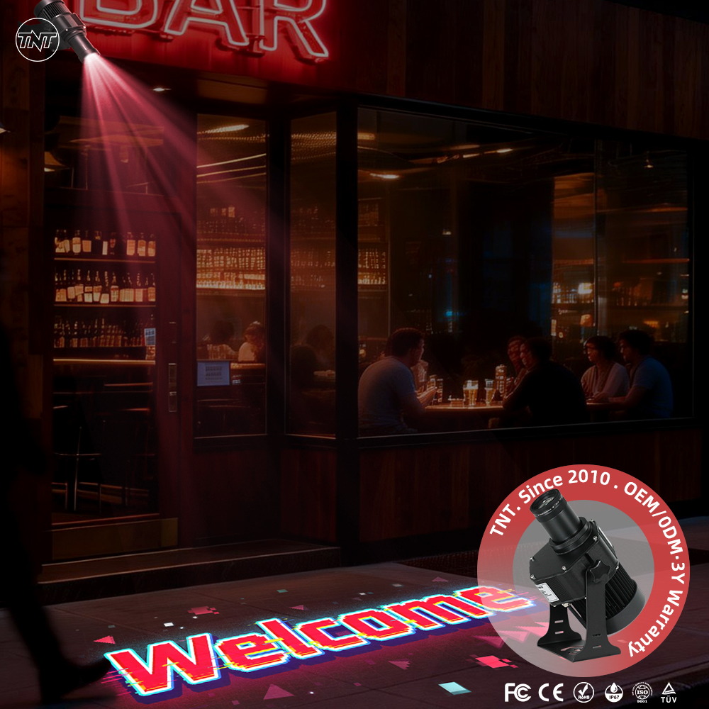
When the sun dips below the skyline, most storefronts go quiet. But yours doesn't have to. A single warm beam grazing a hand-lettered sign, a wash of cobalt across a textured wall, or a soft pool of amber around a product display can pull a passerby out of their late-night thoughts and into your world. Light becomes the narrator—it whispers where spotlights are too loud, and it lingers long after the first glance.
Think about the story you'd tell if you only had shadows to work with. A bakery might let a low, golden glow seep through its window, suggesting ovens still warm at midnight. A boutique could edge its mannequins with a cool rim, turning fabric into sculpture. The trick is restraint: don't flood every corner. Let some details hide, let others emerge slowly, the way a good story holds back its best line until the second act.
After dark, your brand doesn't compete with daylight clarity—it trades it for atmosphere, for mood, for the kind of quiet confidence that makes someone cross the street just to see what's glowing. Test it yourself: walk past your space at 10 p.m. with fresh eyes. If the light makes you slow down for no reason at all, you've already started telling a story worth stopping for.
Frame Products with Custom Shapes That Draw the Eye
A frame with a custom shape does more than hold a picture—it interrupts the expected rectangle and gives the wall a pulse. Octagonal edges, softened arch tops, or a lopsided curve can shift how the eye travels across a room. The silhouette becomes part of the art, not just a container.
Think of a triangular frame tucked into a gallery wall, or an oval that breaks a row of standard squares. Those unexpected outlines force a pause. The surrounding décor recedes for a moment, and the frame itself becomes the detail people remember.
Working with non-standard profiles also lets you echo motifs already in the space: a doorway arch repeated in a frame, a tile pattern mirrored in a hexagonal border. The shape, the material, and the wall color can lock together so the frame feels inevitable rather than added on.
Rotate Seasonal Gobos to Keep Storefronts Feeling New
Swapping a gobo takes less than ten minutes, but the shift on the sidewalk can make a storefront feel like it reopened overnight. Keep a small rack of metal or glass patterns near the door—maple leaves for early autumn, bare branches for late fall, a scatter of stars for the first week of December—and rotate them before the previous design starts to feel familiar. The change doesn’t need to scream; even a subtle shift from round dots to elongated leaf shadows changes how people read the entrance.
A rhythm that follows light and weather works better than one tied strictly to calendar dates. In wet spring months, use a pattern with thin lines that catch puddles; in high summer, switch to something airy like seed heads or oversized petals. If you keep four to six gobos on hand and label each sleeve with its best season, a monthly or six-week swap becomes a ten-minute task rather than a design project. Regulars may not consciously notice, but they’ll register the storefront as moving with the season instead of sitting still.
Project Interactive Patterns That Invite Foot Traffic
Static surfaces rarely make people pause. A floor that responds to weight, a wall that ripples with projected light, or a path that changes color as visitors move across it turns a walkway into a shared moment. The goal is not novelty for its own sake, but a subtle invitation: step here, move this way, see what happens next.
Playful repetition works well in public spaces. Simple interactions—like a grid of tiles that glow when stepped on, or a shadow that follows and stretches with a person's silhouette—encourage people to test boundaries, jump, or walk in pairs. When the response is immediate and slightly unpredictable, passersby often become participants, and participants draw spectators.
Placement matters more than complexity. Near entrances, waiting areas, or long corridors, an interactive pattern can redirect flow and soften the anonymity of a large building. The best designs feel resilient—able to handle rain, scuffs, and thousands of steps—while still offering a fresh surprise for each new pair of feet.
Highlight Key Areas with Directional Brand Cues
Directional brand cues act as quiet tour guides within a visual layout. Instead of relying on arrows or overt pointers, they use repeated shapes, lines, and even the gaze of a model to steer attention toward specific product clusters or messaging blocks. When every curve of a custom illustration tilts toward the same corner, or the negative space funnels naturally into a headline, the eye follows without consciously decoding the instruction. This creates a hierarchy that feels intuitive rather than imposed.
To make key areas truly stand out, pair directional cues with intentional separation. Give high-value content breathing room that surrounding elements subtly point toward, whether through a diagonal cut in the hero image, a sequence of icons drifting upward, or type that slightly skews in one direction. The strongest cues are often irregular — a hand-drawn swoosh, an unexpected shadow cast at an angle, or a broken grid line that draws focus exactly where the brand wants the visitor to linger.
Avoid overusing these cues, since too many competing directions muddle the hierarchy and feel artificial. Limit each viewport to one primary cue cluster, and let secondary cues reinforce rather than rival it. When tests reveal a change in dwell time or click depth on the highlighted region, you have found the balance between subtle guidance and genuine discovery.
FAQ
A custom gobo projector uses a precision-cut metal or glass stencil (the gobo) to cast your chosen design—logo, pattern, message—onto surfaces. Unlike generic projectors with fixed images, custom gobos let you swap artwork, adjust focus, and project at various sizes, making each installation feel tailor-made for the venue.
Light-colored, matte surfaces give the crispest results. Think smooth walls, frosted glass, or even fabric backdrops. Glossy or dark surfaces tend to scatter light and wash out fine details, so if you're stuck with a tricky backdrop, opt for a higher-wattage projector or a gobo with bolder lines.
While indoor dim lighting is ideal, outdoor use is possible after dusk or in shaded areas. For daytime visibility, you'd need an extremely high-lumen projector and a simple, high-contrast design—but realistically, gobos shine brightest at evening events, storefront windows after hours, or covered patios.
Try projecting a subtle texture like foliage or ripples across a ceiling to set a mood, casting directional cues on the floor for wayfinding, or creating a moving welcome message on a sidewalk outside your storefront. Some brands project seasonal icons onto product displays or use gobos to highlight a featured item on a shelf.
Glass gobos offer higher resolution and can reproduce fine details, gradients, and even multi-color designs—ideal for complex logos or photographic elements. Metal gobos are more budget-friendly and durable for simple, bold shapes or text. If your artwork has thin lines or small text, glass is worth the investment.
Overcomplicating the artwork. Tiny text, intricate patterns, or low-contrast elements get lost once projected, especially from a distance. Stick to one clear focal point, use thick strokes, and leave negative space. Test a mockup at actual projection distance before committing.
Not really. Most units are compact and mount on a standard tripod or clamp. The key is locking the focus and framing before guests arrive. For pop-ups, choose a projector with a quick-release gobo slot so you can swap designs in seconds without realigning the whole unit.
Absolutely. Many shops keep a low-profile projector mounted near the entrance to cast a logo or pattern on the floor throughout store hours. Just make sure it's positioned out of customer reach, and consider a model with a long-lasting LED light source to avoid frequent bulb changes.
Conclusion
Most storefronts go dark and forgettable the moment the sun sets, but a custom gobo projector changes that in seconds. Instead of relying on generic signage, you can cast your logo directly onto the sidewalk just outside your door, turning foot traffic into a first impression before anyone even reaches for the handle. Once they step inside, the same approach works overhead or across entryways, pulling the eye toward the products you actually want people to notice. Custom shapes don't just illuminate—they frame. A well-placed beam can wrap a new display in a sharp outline, making it feel curated rather than accidental.
After dark, light becomes the easiest way to extend your brand's personality. Swap in a seasonal gobo for the holidays or a local festival and the whole storefront shifts mood without touching the paint. Interactive patterns—ripples, scattered dots, soft geometric motion—invite people to slow down and step closer, which is half the battle for foot traffic. You can also use directional cues to guide people toward fitting rooms, the register, or a back-of-store feature they'd otherwise miss. The trick is to treat light as part of the design, not an afterthought, so every projection reinforces the same story your brand already tells in daylight.
Contact Us
Contact Person: TNT SALE
Email: [email protected]
Tel/WhatsApp: 8613544277910
Website: https://www.tntprojector.com/